In my previous post I promised a look at the first screens for Authors Notebook. At the core of the app is the notion of multiple notebooks, each world you work on will probably be a separate notebook. To work with this we need a page to select your current notebook - not exciting, but important.
Currently this is the first screen you see when you start AuthorsNotebook. However, on your first use this page will be mostly empty - so I might streamline first startup further so that you jump directly into a new notebook.
Usually you wont see this page often - the app will automatically open your most recently viewed notebook.
Anyway here’s what the notebook page looks like now:
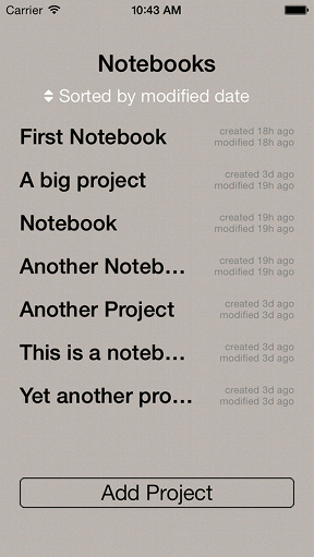
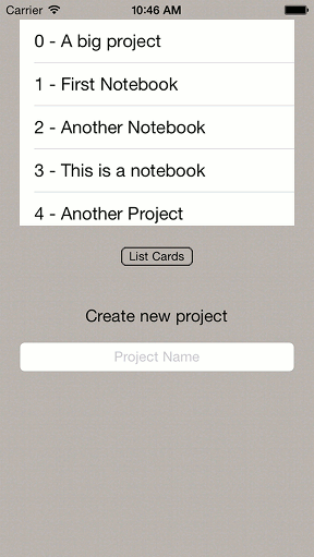
So it’s not the prettiest screen, but then again it’s supposed to be neat and utilitarian. For comparison here’s what the page looked like a few days ago - ugly and confusing: